Worked Example: Plotting the change in butterfly size with climate change
Dai Shizuka
updated 09/28/23
Things you will learn in this module:
- Using publicly available datasets
- Implementing a simple statistical analysis (simple linear regression)
- Making publication-quality figures
- Build custom functions for some simple tasks
Note: This module uses ggplot to generate figures. If you prefer doing everything in Base R, there is an older version of this module here.
1. Using data associated with published papers
Today, we will learn a bit more about plots by trying to re-create a plot from a recent publication. I find playing with open-access data and re-creating analyses & figures to be a very fruitful exercise because you get to learn codes, but you also get to really understand the studies much better.
For this exercise, I have chosen a paper by Bowden et al. (2015) in Biology Letters.1 This study used a 17-year dataset on wing lengths of two butterfly species in Greenland to show that both species follow the “temperature-size” rule, which posits that higher temperatures generally select for smaller adult body size.

Aside from it being an interesting story, I chose this paper as an example for several reasons. First, the data are pretty straightforward–wing lengths of individuals, sex of individuals, and a few climatic data such as snowmelt day, average spring temperature and average spring/summer temperature of the previous year. More importantly, the authors made the raw data publicly available through the Dryad data repoistory (datadryad.org). Here is the link to the raw data for this particular study: http://dx.doi.org/10.5061/dryad.43gt3 (you can find this information under “Data accessibility”, right before References).
You can see that there is a link to an excel file (in .xlsx format) that contains the wing length data. In this case, there is no associated readme file (though it is encouraged by Dryad to include one), but the data are self-explanatory enough. Go ahead and download the data file and open it in Microsoft Excel.
What you will see is a single worksheet with both species data. For each species, there are 9 columns: year, site, sex, WL (wing length), DOY (day of year of capture), snow (day of snowmelt), snow.1 (day of snowmelt in the previous year), mayjun (average May-June temperature), mayaug.1 (Average May-Aug temperature of previous year).
Now, since R will have a hard time reading this data, let’s manually create two separate data files and save them as .csv files. Follow these directions:
- Select and copy the 9 columns of data for Boloria chariclea
- Open a New Workbook (command-N) and paste the data
- Save the file as “boloria.csv” in your folder for this week.
- Do the same for Colias hecla, and save that file as “colias.csv”
Now, let’s import these data to R:
#import the data
boloria=read.csv("data/boloria.csv")
colias=read.csv("data/colias.csv")
head(boloria) #look at one of the dataframes
## year site sex WL DOY snow snow.1 mayjun mayaug.1
## 1 1996 2 m 17.56 189 158.8 NA -1.7558 NA
## 2 1996 2 m 17.91 189 158.8 NA -1.7558 NA
## 3 1996 2 m 17.29 189 158.8 NA -1.7558 NA
## 4 1996 2 f 19.26 196 158.8 NA -1.7558 NA
## 5 1996 2 m 18.82 196 158.8 NA -1.7558 NA
## 6 1996 2 m 17.83 196 158.8 NA -1.7558 NALet’s also load the R packages we will use:
library(tidyverse)
library(cowplot)
Now, we can proceed with our exercise.
2. Recreating Figure 1: Scatterplot with fit line
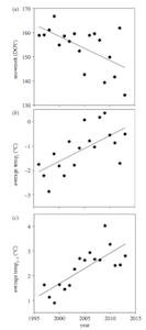
The first thing we will try is to re-create Figure 1, which has three panels and shows how the snowmelt dat, average May-June temperature, and average May-August temperature (of the previous year) has changed across the study period. They present this as a scatterplot and a simple linear regression fit line.
Alright, let’s try to re-create this!
5.2.1 Multi-panel scatterplot using ggplot and cowplot
First thing we’ll do is re-create the scatterplot of Figure 1a: The date of snowmelt by year. Close reading of the supplemental methods section tells us that this is the first day of the year that less than 50% of the site was covered in snow.
The dataset we have downloaded is organized by individual butterflies that were caught during the study. However, the snowmelt and temperature information are the same for all rows for a given year (and this info is the same for both species of butterfly).
So we can actually extract all of the information we need for this
figure from this data. All we need to do is to group the data by
year and summarize the snowmelt and
temperature data for each year by taking the mean. To do this, we will
can use the group_by() and summarize()
functions in the dplyr package (included in the
tidyverse package we loaded).
Let’s use this to create a dataframe that has all of the information we need: year, average snowmelt day, average May-June temperature of that year, and average May-August temperature of the previous year:
year.dat=boloria %>% group_by(year) %>% summarise(mean.snow=mean(snow), mean.mayjun=mean(mayjun), mean.mayaug=mean(mayaug.1))
year.dat
## # A tibble: 17 × 4
## year mean.snow mean.mayjun mean.mayaug
## <int> <dbl> <dbl> <dbl>
## 1 1996 159. -1.76 NA
## 2 1997 159 -2.22 1.63
## 3 1998 161 -2.87 1.13
## 4 1999 167. -1.32 0.894
## 5 2000 155. -1.82 1.64
## 6 2001 158. -2.22 1.45
## 7 2002 156. -0.815 1.61
## 8 2003 160. -1.79 2.27
## 9 2004 152. -1.08 2.69
## 10 2005 143. 0.0715 2.62
## 11 2006 159. -0.790 2.93
## 12 2007 160. -1.04 2.66
## 13 2008 157. 0.178 2.63
## 14 2009 139. 0.355 4.02
## 15 2011 142. -0.870 2.41
## 16 2012 162. -1.71 2.44
## 17 2013 131 -0.509 2.80Let’s try plotting on of the panels of Figure 1 here using this data. Here is the plot for average snowmelt date across years.
p1=ggplot(year.dat, aes(x=year, y=mean.snow)) +
  geom_point()
p1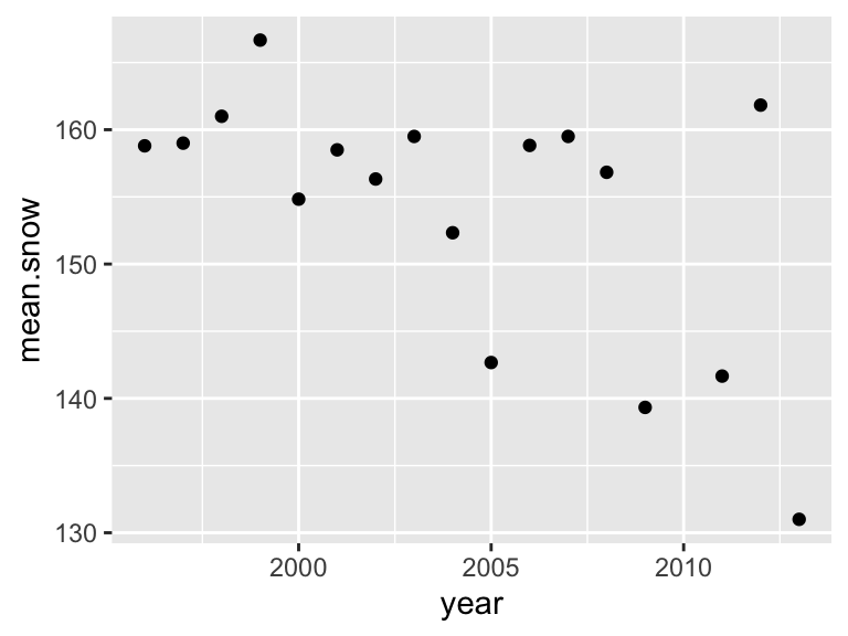
In ggplot, it’s also easy to add the simple linear regression line on
this plot by using stat_smooth(method="lm"):
p1=ggplot(year.dat, aes(x=year, y=mean.snow)) +
  geom_point() +
  stat_smooth(method="lm")
p1
## `geom_smooth()` using formula = 'y ~ x'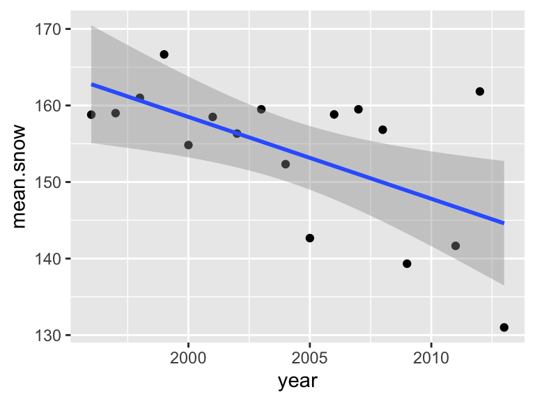
Let’s get rid of the confidence interval and make the line black.
p1=ggplot(year.dat, aes(x=year, y=mean.snow)) +
  geom_point() +
  stat_smooth(method="lm", se=FALSE, color="black")
p1
## `geom_smooth()` using formula = 'y ~ x'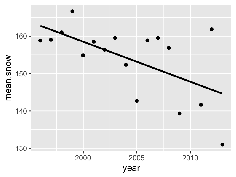
We can plot the other two panels in the same way:
p2=ggplot(year.dat, aes(x=year, y=mean.mayjun)) +
  geom_point() +
  stat_smooth(method="lm", se=FALSE, color="black")
p2
## `geom_smooth()` using formula = 'y ~ x'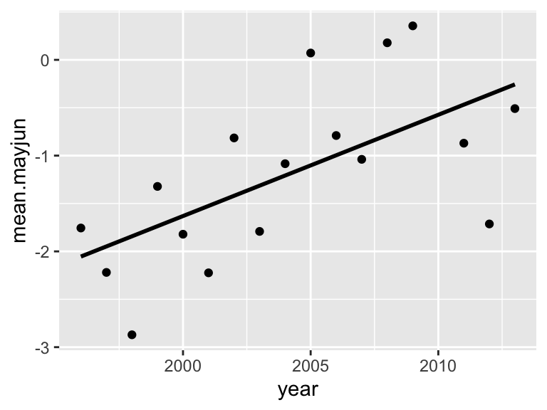
p3=ggplot(year.dat, aes(x=year, y=mean.mayaug)) +
  geom_point() +
  stat_smooth(method="lm", se=FALSE, color="black")
p3
## `geom_smooth()` using formula = 'y ~ x'## Warning: Removed 1 rows containing non-finite values (`stat_smooth()`).## Warning: Removed 1 rows containing missing values (`geom_point()`).
Now, we’ve created 3 different scatterplots. But what we want is to make one figure with 3 panels arranged vertically. How do we do that?
The R package called cowplot makes the task of making multi-panel plots very easy (The “cow” in “cowplot” stands for Claus O. Wilkes, who wrote the package).
plot_grid(p1, p2, p3, align="v", nrow=3) ## `geom_smooth()` using formula = 'y ~ x'
## `geom_smooth()` using formula = 'y ~ x'
## `geom_smooth()` using formula = 'y ~ x'## Warning: Removed 1 rows containing non-finite values (`stat_smooth()`).## Warning: Removed 1 rows containing missing values (`geom_point()`).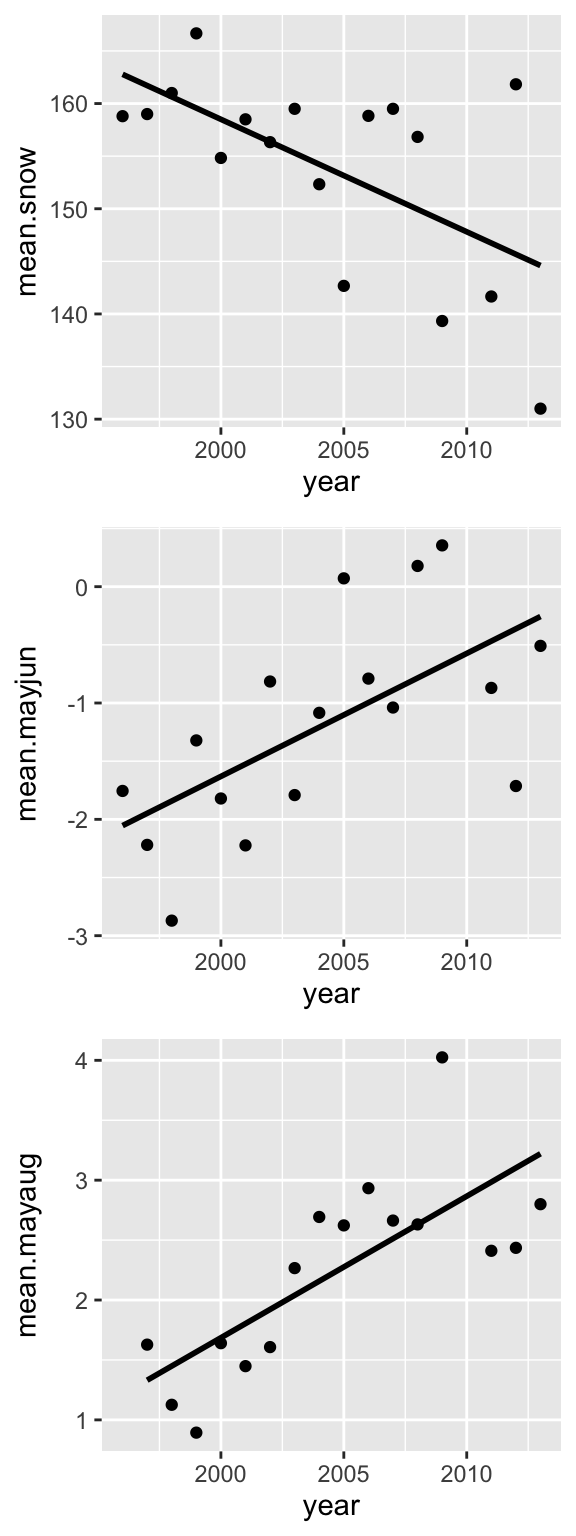 Now let’s clean up the theme and axis labels.
p1=ggplot(year.dat, aes(x=year, y=mean.snow)) +
  geom_point() +
  stat_smooth(method="lm", se=FALSE, color="black") +
  theme_cowplot() +
  labs(y="Snowmelt (DOY)", x="Year") +
  theme(axis.title.y = element_text(size=12))

p2=ggplot(year.dat, aes(x=year, y=mean.mayjun)) +
  geom_point() +
  stat_smooth(method="lm", se=FALSE, color="black") +
  theme_cowplot() +
  labs(y=expression(paste("Average Temperature"["t"],
    " ", (~degree * C))), x="Year") +
  theme(axis.title.y = element_text(size=12))

p3=ggplot(year.dat, aes(x=year, y=mean.mayaug)) +
  geom_point() +
  stat_smooth(method="lm", se=FALSE, color="black") +
  theme_cowplot() +
  labs(y=expression(paste("Average Temperature"["t-1"], " ",
        (~degree * C))), x="Year") +
  theme(axis.title.y = element_text(size=12))

plot_grid(p1, p2, p3, nrow=3)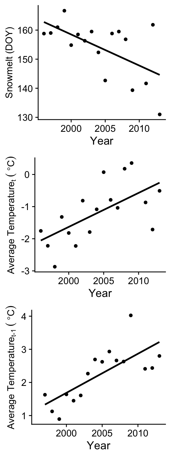
3. Getting model results for linear regression using
lm()
ggplot has allowed us to put a linear regression fit line on our plots very easily, but we also want to get the statistical results to report in the main text. So let’s do this.
Let’s start from the beginning: what is a linear regression? A lot of people think that linear regression is a form of a linear model. A linear model is a class of statistic models in which the value of interest is described by a linear combination of a series of parameters (regression slopes and intercept). This can actually include curvilinear relationships between the dependent and independent variables.
My aim here is not to provide a thorough lesson on statistics. For that, I suggest you take a proper statistics class or consult a statistics textbook.
Here, we will just tackle the problem of fitting a simple linear regression with one continuous dependent variable (\(y\)) and one continuous independent variable (\(x\)). Thus, we want to fit the linear function \[y=a+bx\] where \(a\) is the intercept and \(b\) is the slope of the line.
To fit this model, we use a model formula syntax inside the
appropriate statistical function. In this case, the appropriate formula
is
y~x
Notice that we replace the equal sign (=) with a tilde (~) and remove the paramters (\(a\) and \(b\)). All R needs to understand our statistical model is the dependent variable(s) (\(y\) in this case) and the independent variable(s) (\(x\) in this case). We will address the formula syntax for more complex statistical models later.
3.1. Fitting a linear model and getting the results
Now, let’s use the simple linear regression to ask the question: what
is the relationship between snowmelt date (dependent variable) and year
(independent variable).2 To do this, we will create an object using
the lm() function, and get the summary output of the model
using the summary() function:
fit.snow=lm(mean.snow~year, data=year.dat)
summary(fit.snow)
##
## Call:
## lm(formula = mean.snow ~ year, data = year.dat)
##
## Residuals:
## Min 1Q Median 3Q Max
## -13.6018 -3.9781 -0.0329 6.7438 16.1590
##
## Coefficients:
## Estimate Std. Error t value Pr(>|t|)
## (Intercept) 2296.8841 748.8165 3.067 0.00782 **
## year -1.0692 0.3736 -2.862 0.01188 *
## ---
## Signif. codes: 0 '***' 0.001 '**' 0.01 '*' 0.05 '.' 0.1 ' ' 1
##
## Residual standard error: 7.948 on 15 degrees of freedom
## Multiple R-squared: 0.3531, Adjusted R-squared: 0.31
## F-statistic: 8.189 on 1 and 15 DF, p-value: 0.01188So this gives us a good overview of the statistical output, but it gives us a lot of information, and you have to know what to look for. Let’s look at these values closely:
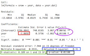
The values reported in the caption of Figure 1 of the paper are in the rectangles:
“Estimate” for the independent variable (year) is the slope parameter \(b\) (red rectangle). The intercept parameter \(a\) is above that.
F-statistic (green rectangle): Ratio of Mean of squares. Compares the amount of variation explained by the regression model and the “left-over variation” (residual sum of squares). The associated degrees of freedom (DF)–i.e., how many independent observations we have of a given variable that can be used to estimate a statistical parameter–are the “regression degrees of freedom”” (# parameters -1) and the “residual degrees of freedom” (sample size - # of parmeters - 1)
P-value: Calculated by comparing the F-ratio with expected distribution of this value.
NOTE: There are also t-statistics and P-values associated with each parameter (in purple circle). These are P-values associated with the null hypotheses that the intercept and slope are equal to 0. This is different than the P-value for the test for the fit of the linear regression model to the data. Thus, those circled values are NOT relevant for us right now.
Now compare these values in the rectangles to the values presented in the figure captions to Figure 1 in the paper. Do you notice that they are slightly different? Can you figure out why they are slightly different?3
3.2. Fitting all three models and organizing the outputs as a table
Now, how we take these kinds of model results and organize them for publication? Well, you could simply copy the relevant numbers from each model and paste them into a table.
Here, we’ll do one better: we will write a function to extract all of
the values that are reported by in the summary() function
and organize them into a table. But this takes a little sleuthing to
understand how to look “under the hood” of these model fits to extract
the information we want.
To get started, let’s look at what is actually included in the output
of the summary() function by using the str()
function:
str(summary(fit.snow))## List of 11
## $ call : language lm(formula = mean.snow ~ year, data = year.dat)
## $ terms :Classes 'terms', 'formula' language mean.snow ~ year
## .. ..- attr(*, "variables")= language list(mean.snow, year)
## .. ..- attr(*, "factors")= int [1:2, 1] 0 1
## .. .. ..- attr(*, "dimnames")=List of 2
## .. .. .. ..$ : chr [1:2] "mean.snow" "year"
## .. .. .. ..$ : chr "year"
## .. ..- attr(*, "term.labels")= chr "year"
## .. ..- attr(*, "order")= int 1
## .. ..- attr(*, "intercept")= int 1
## .. ..- attr(*, "response")= int 1
## .. ..- attr(*, ".Environment")=<environment: R_GlobalEnv>
## .. ..- attr(*, "predvars")= language list(mean.snow, year)
## .. ..- attr(*, "dataClasses")= Named chr [1:2] "numeric" "numeric"
## .. .. ..- attr(*, "names")= chr [1:2] "mean.snow" "year"
## $ residuals : Named num [1:17] -3.98 -2.71 0.36 7.1 -3.67 ...
## ..- attr(*, "names")= chr [1:17] "1" "2" "3" "4" ...
## $ coefficients : num [1:2, 1:4] 2296.884 -1.069 748.817 0.374 3.067 ...
## ..- attr(*, "dimnames")=List of 2
## .. ..$ : chr [1:2] "(Intercept)" "year"
## .. ..$ : chr [1:4] "Estimate" "Std. Error" "t value" "Pr(>|t|)"
## $ aliased : Named logi [1:2] FALSE FALSE
## ..- attr(*, "names")= chr [1:2] "(Intercept)" "year"
## $ sigma : num 7.95
## $ df : int [1:3] 2 15 2
## $ r.squared : num 0.353
## $ adj.r.squared: num 0.31
## $ fstatistic : Named num [1:3] 8.19 1 15
## ..- attr(*, "names")= chr [1:3] "value" "numdf" "dendf"
## $ cov.unscaled : num [1:2, 1:2] 8.88e+03 -4.43 -4.43 2.21e-03
## ..- attr(*, "dimnames")=List of 2
## .. ..$ : chr [1:2] "(Intercept)" "year"
## .. ..$ : chr [1:2] "(Intercept)" "year"
## - attr(*, "class")= chr "summary.lm"There is actually a tremendous amount of information stored in here. We just have to go through one by one and figure out where the values we want are.
For example, the F value is listed as $ fstatistic. To
get that, you have to do:
summary(fit.snow)$fstatistic## value numdf dendf
## 8.189075 1.000000 15.000000Then, you see that actually, this contains three values: (1) The F-value, and (2,3) the degrees of freedom of the model. We want to save all of these, so we do:
F.snow=round(summary(fit.snow)$fstatistic[1],3)
dfs.snow=summary(fit.snow)$fstatistic[2:3]
We can do the same with R^2, Slope and P-value:
r2.snow=round(summary(fit.snow)$adj.r.squared,3)
slope.snow=round(summary(fit.snow)$coefficients[2,1],3)
p.snow=round(summary(fit.snow)$coefficients[2,4],3)
Now let’s put all of that as a dataframe.
table.dat=data.frame(F.value=F.snow, df=paste(dfs.snow[1], dfs.snow[2], sep=","), r2=r2.snow, slope=slope.snow, p.value=p.snow)
table.dat
## F.value df r2 slope p.value
## value 8.189 1,15 0.31 -1.069 0.012Now, we want to do this for all three models we want to fit: the change across years in snowmelt date, may-june temperature, and may-august temperature. But doing the whole routine three times is kind of annoying, so I’m going to make a little function that will extract the relevant output values from any linear model with one response variable and one predictor variable:
make.mod.table=function(model) {
  F.value=round(summary(model)$fstatistic[1],3)
  dfs=summary(model)$fstatistic[2:3]
  r2=round(summary(model)$adj.r.squared,3)
  slope=round(summary(model)$coefficients[2,1],3)
  P.value=round(summary(model)$coefficients[2,4],3)
  data.frame(F.value=F.value, df=paste(dfs[1], dfs[2], sep=","), r2=r2, slope=slope, P.value=P.value)
}
Now, let’s go ahead and fit those other two models:
fit.mayjun=lm(mean.mayjun~year, data=year.dat)
fit.mayaug=lm(mean.mayaug~year, data=year.dat)
Now, I’m going to run the custom make.mod.table()
function here to all three models using an lapply()
function. The output will be a list of dataframes.
table.dats=lapply(list(fit.snow, fit.mayjun, fit.mayaug), make.mod.table)
table.dats
## [[1]]
## F.value df r2 slope P.value
## value 8.189 1,15 0.31 -1.069 0.012
##
## [[2]]
## F.value df r2 slope P.value
## value 9.465 1,15 0.346 0.106 0.008
##
## [[3]]
## F.value df r2 slope P.value
## value 17.629 1,14 0.526 0.118 0.001Now, I want to combine them into one data frame. I will use the
bind_rows() function from dplyr:
table.all=bind_rows(table.dats)
table.all
## F.value df r2 slope P.value
## value...1 8.189 1,15 0.310 -1.069 0.012
## value...2 9.465 1,15 0.346 0.106 0.008
## value...3 17.629 1,14 0.526 0.118 0.001I’ll make a quick edit to add a model names as row names:
rownames(table.all)=c("snow", "may-june", "may-august")
table.all
## F.value df r2 slope P.value
## snow 8.189 1,15 0.310 -1.069 0.012
## may-june 9.465 1,15 0.346 0.106 0.008
## may-august 17.629 1,14 0.526 0.118 0.001Just for kicks, I’ll display the table in Rmarkdown in a somewhat pretty format:
knitr::kable(table.all, format="pipe", align='c')| F.value | df | r2 | slope | P.value | |
|---|---|---|---|---|---|
| snow | 8.189 | 1,15 | 0.310 | -1.069 | 0.012 |
| may-june | 9.465 | 1,15 | 0.346 | 0.106 | 0.008 |
| may-august | 17.629 | 1,14 | 0.526 | 0.118 | 0.001 |
If you want to export this table to excel, you can write it as a .csv file:
write.csv(table.all, "summary_table.csv")4. Recreating Figure 2a,b
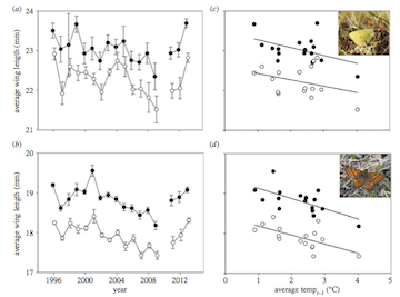
Now, we will work on re-creating Figure 2, which is a 4-panel figure with the average wing length of males and females (and error bars) for each species (panels a and b), and the relationship between average wing length and the average May-August temperature of the previous year (panels c and d).
4.1 Panels (a) and (b): Plotting the mean wing lengths by year, species and sex
First thing we need to do to construct this figure is to calculate
the mean wing lengths for each year for each species and sex. We also
want to get the Standard Error of the Mean for these estimates. We can
do this with group_by() and summarize()
functions that we used in a previous module, plus the hand
mean_se() function that will generate both the mean and
standard errors.
Let’s start with Colias hecla since that is the first panel.
wl.colias=colias %>% group_by(year, sex) %>% summarise(mean_se(WL)) #calculate the mean of WL by year and sex for the colias dataset.## `summarise()` has grouped output by 'year'. You can override using the
## `.groups` argument.You can see that this generates three columns: “y”, which is the mean, and “ymin” and “ymax”, which correspond to the lower and upper ends of the standard error.
So now we have the data that we need to generate the plot for Panel
A. Let’s start building it! What we want to do is plot the data for one
sex (say female), and then add the points for the second sex (male) on
that same plot. To do this, a useful function is subset(),
which allows us to easily specify a subset of data. Try this to plot the
data for just the females:
ggplot(wl.colias, aes(x=year, y=y, group=sex)) +
  geom_path() +
  geom_point(aes(fill=sex), pch=21, size=2) +
  scale_fill_manual(values=c("black", "white"))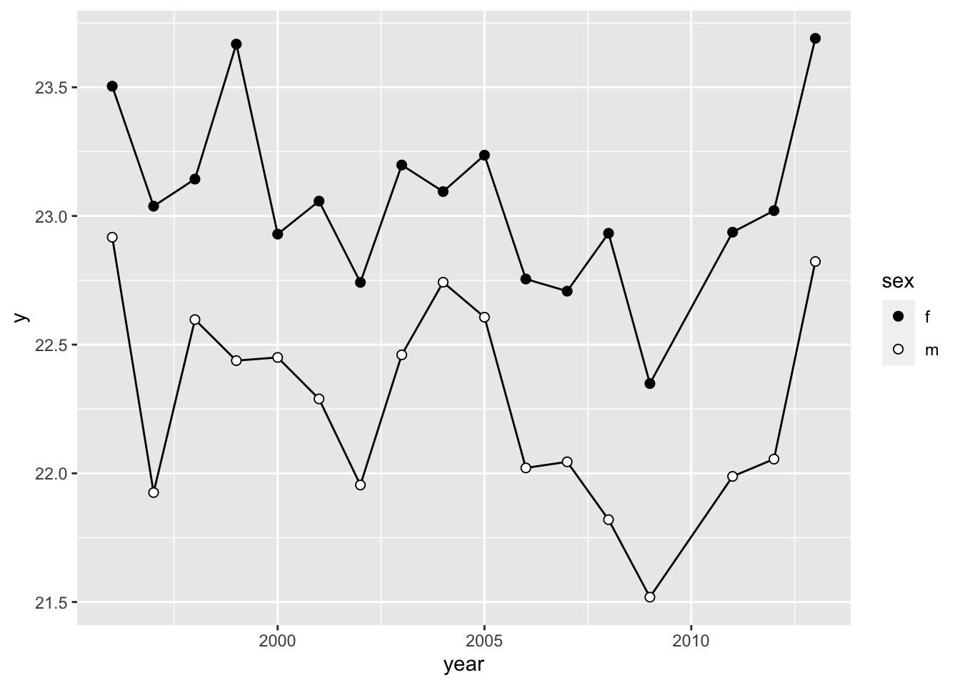
Note that I plot the geom_path() (i.e., the lines) here
first before the points. This makes it so that the lines show up behind
the points.
Notice that there is one problem here, which is that the plot connects the dots between the years 2009 and 2011, even though the data for 2010 is missing. The figure in the publication correctly omits this line. We will address this later.
We can add errorbars to the points on our figure by simply adding
geom_errorbar(). Here, we specify the minimum and maximum
values of the error bar by subtracting or adding the standard error to
the mean, respectively.
ggplot(wl.colias, aes(x=year, y=y, group=sex)) +
  geom_path() +
  geom_point(aes(fill=sex), pch=21, size=2) +
  scale_fill_manual(values=c("black", "white")) +
  geom_errorbar(aes(ymin=ymin, ymax=ymax))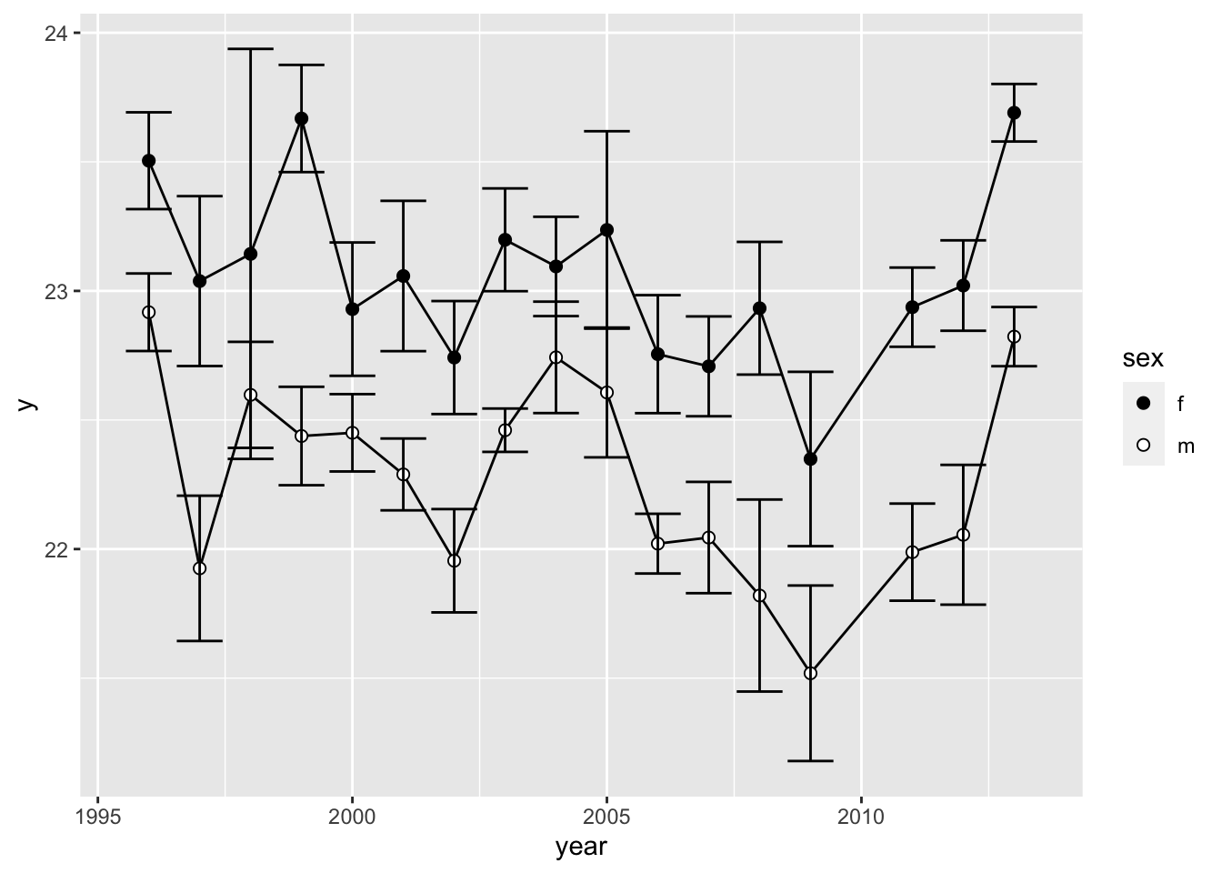
Now, let’s make it look a bit prettier and save the plot as `p.2a’
p.2a=ggplot(wl.colias, aes(x=year, y=y, group=sex)) +
  geom_path() +
  geom_errorbar(aes(ymin=ymin, ymax=ymax), width=0.5) +
  geom_point(aes(fill=sex), pch=21, size=2) +
  scale_fill_manual(values=c("black", "white")) +
  theme_cowplot() +
  labs(y="Average Wing Length (mm)")
p.2a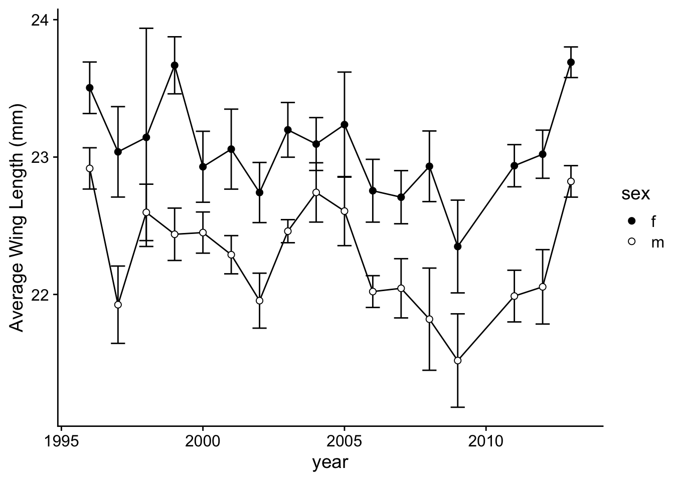
Now, let’s do the same with Boloria (Figure 2b):
Create the summary data with standard error included:
wl.boloria=boloria %>% group_by(year, sex) %>% summarise(mean_se(WL)) ## `summarise()` has grouped output by 'year'. You can override using the
## `.groups` argument.Create the plot as you did with the Figure 2a, but now save it as
p.2b:
p.2b=ggplot(wl.boloria, aes(x=year, y=y, group=sex)) +
  geom_path() +
  geom_errorbar(aes(ymin=ymin, ymax=ymax), width=0.5) +
  geom_point(aes(fill=sex), pch=21, size=2) +
  scale_fill_manual(values=c("black", "white")) +
  theme_cowplot() +
  labs(y="Average Wing Length (mm)")
p.2b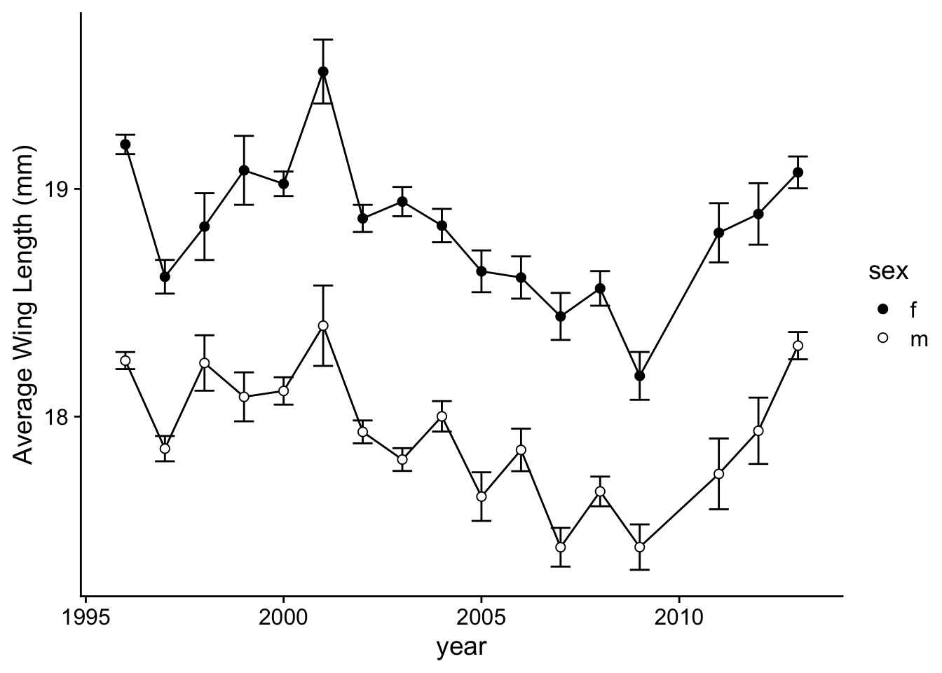
4.2. Further tweaking the plot:
To go further, we can fix the details like skipping the year 2010 by plotting the points for years <2010 and years >2010 separately for each sex and each species, all in two vertical panels. I’ll also adjust the tick marks a bit:
p.2a=ggplot(wl.colias, aes(x=year, y=y, group=sex)) +
  geom_path(data=wl.colias %>% filter(year<2010)) +
  geom_path(data=wl.colias %>% filter(year>2010)) +
  geom_errorbar(aes(ymin=ymin, ymax=ymax), width=0.5) +
  geom_point(aes(fill=sex), pch=21, size=2) +
  scale_fill_manual(values=c("black", "white")) +
  theme_cowplot() +
  labs(y="Average Wing Length (mm)")
p.2a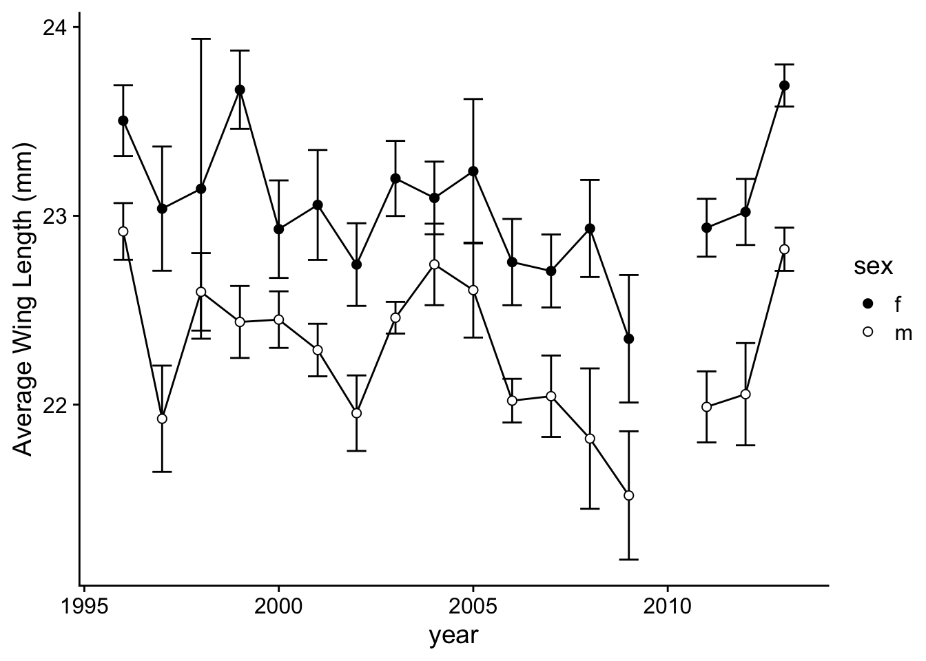
p.2b=ggplot(wl.boloria, aes(x=year, y=y, group=sex)) +
  geom_path(data=wl.boloria %>% filter(year<2010)) +
  geom_path(data=wl.boloria %>% filter(year>2010)) +
  geom_errorbar(aes(ymin=ymin, ymax=ymax), width=0.5) +
  geom_point(aes(fill=sex), pch=21, size=2) +
  scale_fill_manual(values=c("black", "white")) +
  theme_cowplot() +
  labs(y="Average Wing Length (mm)")
p.2b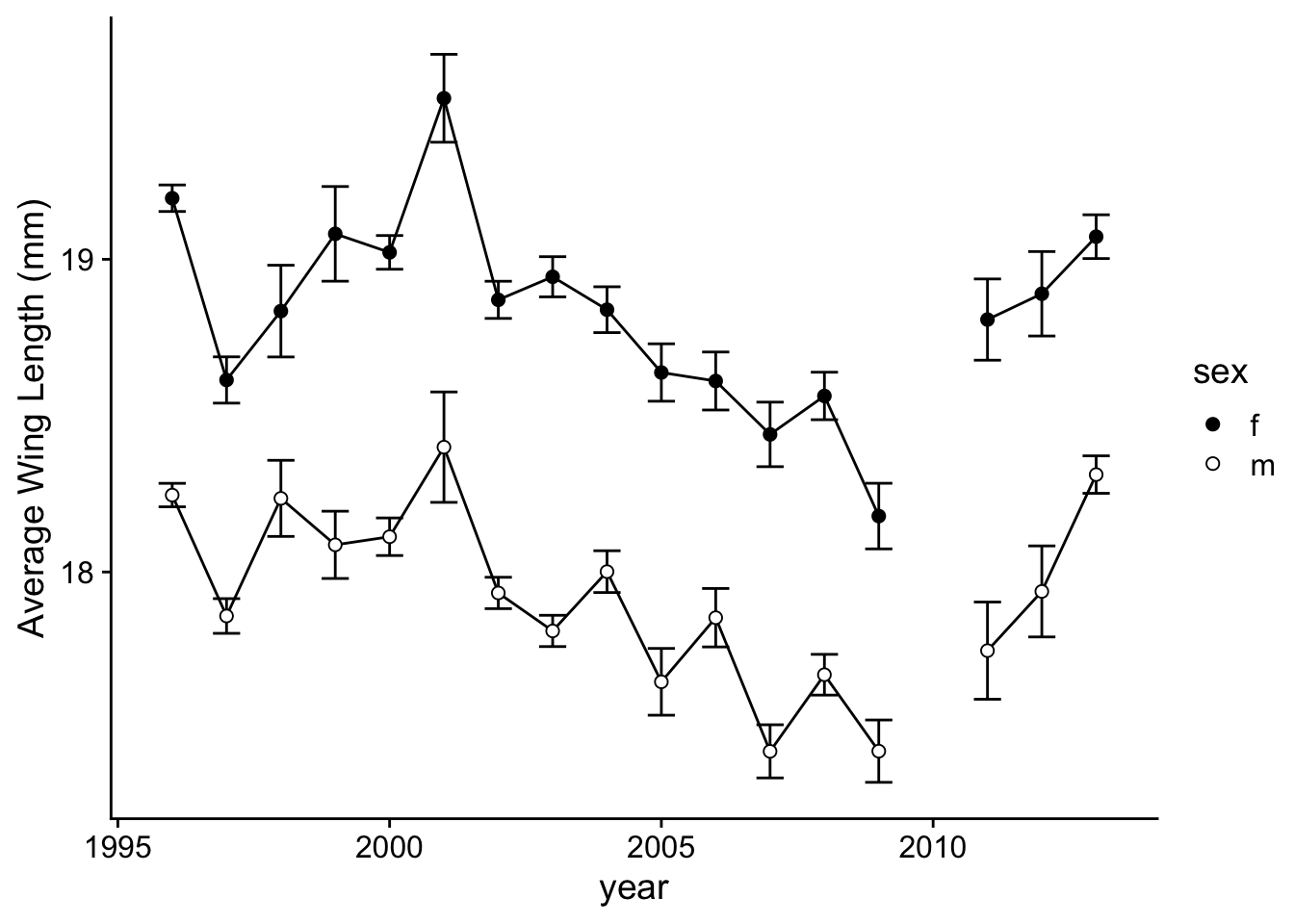
5. Recreating Figure 2c,d
Ok, the final plots to make are the Figures 2(c,d), which are plots
of the relationships between average wing length of a
population/year/sex and the May-August temperature of the previous
year.
The good news is that we have covered everything you need to
know to make these figures! Think about it for a minute and see
if you can visualize the steps you need to complete to get this data
Ok, let’s start. Note that we have created several different dataframes so far.
One called
year.datcontains the average snowmelt date, average May-June temperature, and average May-August temperature across years.One called
wl.coliascontains data on annual average + standard error of wing length for Colias heclaOne called
wl.boloriacontains data on annual average + standard error of wing length for Boloria chariclea
Let’s take a quick look at the year.dat and
wl.colias dataframes:
year.dat## # A tibble: 17 × 4
## year mean.snow mean.mayjun mean.mayaug
## <int> <dbl> <dbl> <dbl>
## 1 1996 159. -1.76 NA
## 2 1997 159 -2.22 1.63
## 3 1998 161 -2.87 1.13
## 4 1999 167. -1.32 0.894
## 5 2000 155. -1.82 1.64
## 6 2001 158. -2.22 1.45
## 7 2002 156. -0.815 1.61
## 8 2003 160. -1.79 2.27
## 9 2004 152. -1.08 2.69
## 10 2005 143. 0.0715 2.62
## 11 2006 159. -0.790 2.93
## 12 2007 160. -1.04 2.66
## 13 2008 157. 0.178 2.63
## 14 2009 139. 0.355 4.02
## 15 2011 142. -0.870 2.41
## 16 2012 162. -1.71 2.44
## 17 2013 131 -0.509 2.80wl.colias## # A tibble: 34 × 5
## # Groups: year [17]
## year sex y ymin ymax
## <int> <chr> <dbl> <dbl> <dbl>
## 1 1996 f 23.5 23.3 23.7
## 2 1996 m 22.9 22.8 23.1
## 3 1997 f 23.0 22.7 23.4
## 4 1997 m 21.9 21.6 22.2
## 5 1998 f 23.1 22.3 23.9
## 6 1998 m 22.6 22.4 22.8
## 7 1999 f 23.7 23.5 23.9
## 8 1999 m 22.4 22.2 22.6
## 9 2000 f 22.9 22.7 23.2
## 10 2000 m 22.5 22.3 22.6
## # ℹ 24 more rowsNote that both of these dataframes have a common variable: the year.
So, we can use that variable as a link to merging these to dataframes
together. That is, we can create a dataframe that includes the wing
length data AND the climate variables. To do this, we can use a
_join() function in dplyr to merge data.
Here, we’ll use left_join():
wl.colias %>% left_join(., year.dat)## Joining with `by = join_by(year)`## # A tibble: 34 × 8
## # Groups: year [17]
## year sex y ymin ymax mean.snow mean.mayjun mean.mayaug
## <int> <chr> <dbl> <dbl> <dbl> <dbl> <dbl> <dbl>
## 1 1996 f 23.5 23.3 23.7 159. -1.76 NA
## 2 1996 m 22.9 22.8 23.1 159. -1.76 NA
## 3 1997 f 23.0 22.7 23.4 159 -2.22 1.63
## 4 1997 m 21.9 21.6 22.2 159 -2.22 1.63
## 5 1998 f 23.1 22.3 23.9 161 -2.87 1.13
## 6 1998 m 22.6 22.4 22.8 161 -2.87 1.13
## 7 1999 f 23.7 23.5 23.9 167. -1.32 0.894
## 8 1999 m 22.4 22.2 22.6 167. -1.32 0.894
## 9 2000 f 22.9 22.7 23.2 155. -1.82 1.64
## 10 2000 m 22.5 22.3 22.6 155. -1.82 1.64
## # ℹ 24 more rowsSo let’s do this for each species and save the dataframes.
wl.colias=wl.colias %>% left_join(., year.dat)## Joining with `by = join_by(year)`wl.boloria=wl.boloria %>% left_join(., year.dat)## Joining with `by = join_by(year)`Now, we can make a scatterplot for each species’ winglength by the annual average temperature (May-August) where the average female wing lengths are filled black and males are filled white + add the linear regression line as we did with Figure 1.
ggplot(wl.colias, aes(x=mean.mayaug, y=y, fill=sex)) +
  geom_point(pch=21, size=2) +
  scale_fill_manual(values=c("black", "white")) +
  stat_smooth(method="lm", se=F, color="black")
## `geom_smooth()` using formula = 'y ~ x'## Warning: Removed 2 rows containing non-finite values (`stat_smooth()`).## Warning: Removed 2 rows containing missing values (`geom_point()`).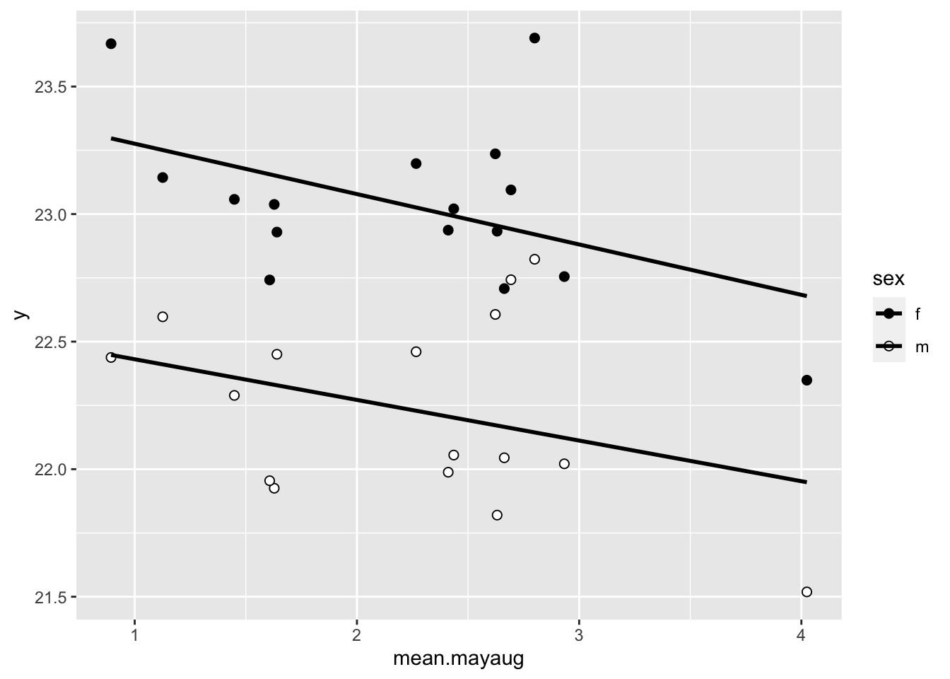
Let’s make it prettier and save it as p.2c
p.2c=ggplot(wl.colias, aes(x=mean.mayaug, y=y, fill=sex)) +
  geom_point(pch=21, size=2) +
  scale_fill_manual(values=c("black", "white")) +
  stat_smooth(method="lm", se=F, color="black") +
  theme_cowplot() +
  labs(x = "May-Aug temp (t-1)", y = "average wing length (mm)")
p.2c
## `geom_smooth()` using formula = 'y ~ x'## Warning: Removed 2 rows containing non-finite values (`stat_smooth()`).## Warning: Removed 2 rows containing missing values (`geom_point()`).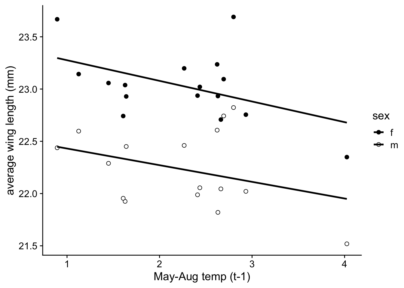
We can do the same thing with Boloria:
p.2d=ggplot(wl.boloria, aes(x=mean.mayaug, y=y, fill=sex)) +
  geom_point(pch=21, size=2) +
  scale_fill_manual(values=c("black", "white")) +
  stat_smooth(method="lm", se=F, color="black") +
  theme_cowplot() +
  labs(x = "May-Aug temp (t-1)", y = "average wing length (mm)")
p.2d
## `geom_smooth()` using formula = 'y ~ x'## Warning: Removed 2 rows containing non-finite values (`stat_smooth()`).## Warning: Removed 2 rows containing missing values (`geom_point()`).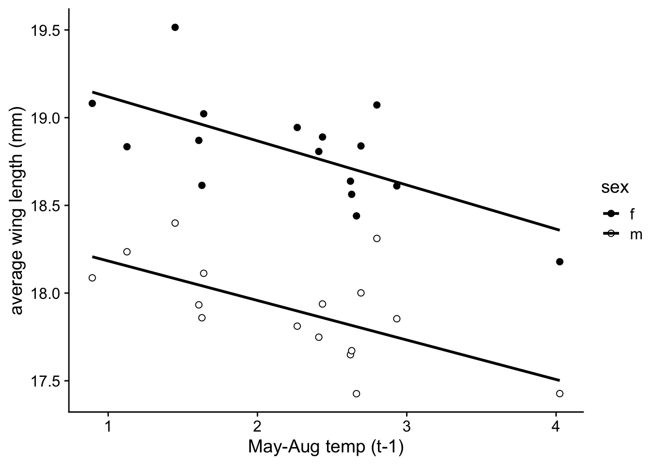
6. Create Figure 2
Now organize these into a multi-panel plot!
plot_grid(p.2a, p.2c, p.2b, p.2d, nrow=2)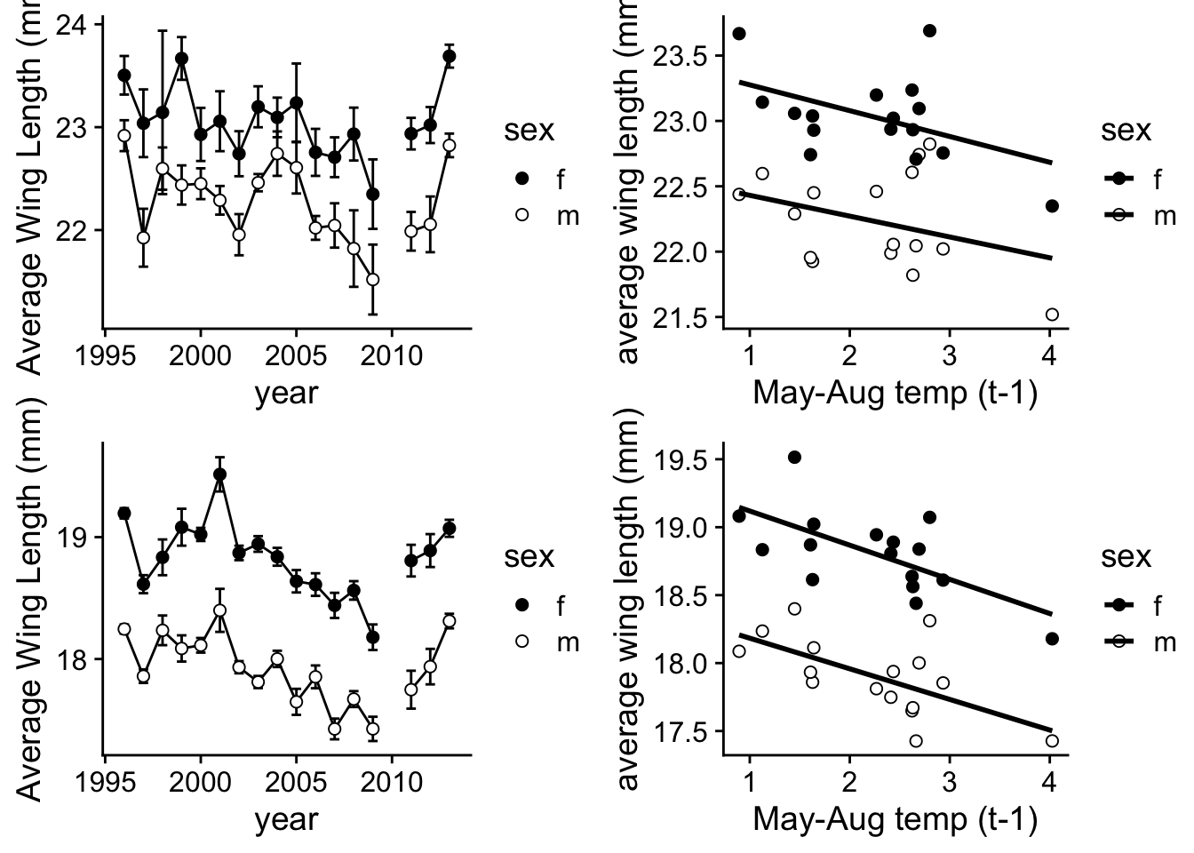
Ok, I hope you feel like you learned some things by going through this exercise!
Bowden, JJ, Eskildsen, A., et al. (2016) High-Arctic butterflies become smaller with rising temperatures. Biology Letters 11: 20150574.↩︎
Here, notice that technically speaking, “year” is not a continuous variable… one might conceivably argue that there are more appropriate statistical approach to analyzing this type of time-series data.↩︎
The discrepancy between the values that come out of our analysis and what is reported in the publication arises because the supplementary data is actually missing one data point for the climate variables that is included in the final publication (year 2010). This seems to be due to the fact that butterflies were not measured in 2010, and so that year does not appear in the supplemental data. However, the climate data for that year is available, so it is included in the analysis presented in Figure 1.↩︎